Saturday, 19 June 2021

final renders 💭

When creating digital art I render each segment of the image in order to be more intentional with toning and creating the shape.

However, my 2-minute film consists of about 7000 frames so that method wouldn't allow me to achieve my style in this short period of time.

Therefore I decided to try a different method by creating a solid silhouette of each movement. Using the cutter too I can loosely paint a neat mask of the right colour over it.

Firstly I had to decide on the appropriate brush and colour to use. That would give the best effect and feel the best.

Brush test; 


I then created a rough planning of the film (video) to test out the chosen rendering style of each scene before application. I decided to abandon the textured brushes and stick to a solid airbrush, this would give the intended style proposed on the module diary.

 In doing this process I even realised areas that could be improved or rearranged in order to tell the story better.


Friday, 18 June 2021

Rotoscoping movements


Rotoscoping: An animation technique in which frames or cels are traced from a live-action movie  - encyclopedia


While creating the scenes I initially relied a lot on rotoscoping each movement, this is because I didn't understand how to properly time and space an action.

below shows a work in progress clip of scene 9 on the timeline where I rotoscoped the movement from a live-action reference of myself.


This method worked well for the first 3 scenes I created, it didn't only help me create believable motion where we can see Flora raising her head fearfully before she opens her eyes. Rotoscoping helped me study my performance more closely. 

As a beginning animator, this method is very helpful to begin the animating process. especially in this case where I and the character share similar features, I get to even imitate more nuances in the face.


Issues:

I noticed rotoscoping didn't really provide room for more obscure movement and the method also seemed to be very time-taking.


creating busy backgrounds for scene 1 shot 1

 Scene 1

The vision of scene 1 was rather difficult to achieve because it was harder to act out every action needed. Therefore I decided to try out creative ways to solve this difficulty

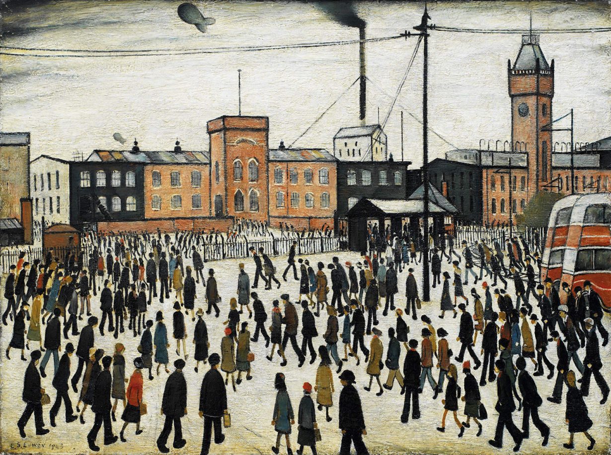
I initially adopted this method of smuggling silhouettes of a busy crowd as done on paintings by LS Lowry

                 L.S. Lowry: 'I'm Fed Up With Painting' - ArtReview

To achieve this painterly feeling I decided to use photoshop.


I ended up abandoning the lowry method. it was difficult for me to replicate the personality of the place with that method.

So I left the smudges but I created defined character extras and props. 


After creating about 30 drawings of people and animals I used them to populate the scene.


Thursday, 3 June 2021

creating the ending Scenes 💬

 This might be my proudest scene so far...

what worked:

As my skills have been evolving I have noticeably been relying less on my references.

so this sequence below is the ending scenes when Flora returns home to a warm embrace by her mother.


VIDEO ðŸ’¬


The rough sketch movement only consists of keyframes and few breakdowns to scale the feeling.

I believe the movement is having more of a cartoony feel to the character. I am most pleased about the stretch I was able to add when the mother moves back to give more emphasis as explained in the illusion of life. This was a problem when rotoscoping because I was guided by realistic actions.


The reason I refer to this as my proudest scene so far is because of creating the ending hug scene. currently, it is still in sketch form but I can already see the personality of a tired young girl and an excited mother. 


What didn't work: 

Its hard to know yet because there is still much refining needed but the main purpose of the sketch movement was to create believable motion so I believe the purpose has been served.


What learning came out of this:

There is less pressure and faster work when the is a prime focus on the action.

How I will apply what I've learnt in the next step:

while creating the characters I focused on one colour section of the character and used colour to separate each. In the next stage, I would focus on one colour group at a time mainly for consistency but also concentrate on the movement and how to make it better.

Monday, 26 April 2021

Breakdowns


Ending

 I struggled in finding out a key ending for my film. I wanted the story to capture resilience by following Flora and I also wanted a believable ending. 

After different ideas such as the antagonist dying (probably unethical) or her running away. I decided to just make her return home but to favour the story arc, her appearance changed to a sadder more dried up version of herself. 


Tuesday, 13 April 2021

Colour script process 🎨


Every colour can be gotten from primary colours therefore I used strips of coloured paper to place scenes into colour families.
 
Coloured paper strips 

Then it was important to blend the colours and allocate them into aspects of the story board.

Rough digital colour blend 

Then I created mood boards made of anagolous painting with complementary accents
 

Scene 1,2,3 mood boards 

Scene 19, 20, 21 and 22 mood boards

 Using the colours derived from mixing and testing. I created a colour palette and colour script indicating radiant areas of focus.

Colour script version 1 

Refining the story extended the colour script and story board. Removing the colour hues allowed me understand the focus on each scene 
Black and white colour script

I realised the background colours were heavy so I reduced the saturation and created silhouettes to see actions clearly and provide an undertone.

Silhouette on b/w backgrounds 

I then had to classify and group scenes and panels according to importance .
Indicating important scenes

I then created colour palettes and linked scenes by interchanging the primary, secondary and accent colours

Colour pick backgrounds 

I then tested the backgrounds in different moods 

Washed out effect

Inverted colours I then coloured in the backgrounds and characters according to my personal feelings.
Eventually I used marine blue and rust orange as symbolic marks to differentiate the two main locations in the film.

Blue and orange 
I then used a black background to make the colours appear more radiant beside it.

Final colour script 


Time passing

The film spans over a period of about a year, however seeing that its only a 2 minute film I struggled with making the time passing. My firs...